Haus Studio
Where restraint becomes eloquence, and every element earns its place
The Practice of Restraint
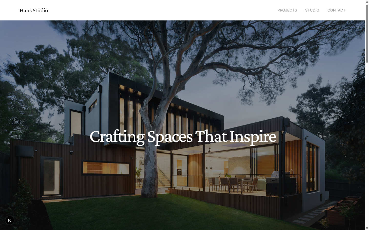
Haus Studio presented a design challenge that inverted the usual brief: how do you communicate premium quality through absence rather than excess? In an industry where portfolios often compete through visual noise and saturated imagery, this project demanded the opposite -- a digital presence that would let architecture speak through silence, whitespace, and the careful curation of what not to show.
The guiding philosophy became the project's north star: “every element must earn its place.” Each component, each animation, each typographic decision was tested against this principle. The result is a monochrome palette of just four tones -- Black, White, Off-White, and Warm Gray -- where the restraint itself becomes the statement. Crimson Pro serif headings breathe through generous letter-spacing, while Inter provides quiet clarity for body text. Animations are slow and intentional, governed by a centralized motion configuration that ensures consistency across every interaction.
The finished portfolio spans ten routes showcasing six fictional Dutch architecture projects, a studio page with team bios and awards timeline, and a contact form. It demonstrates that sophistication in web design, as in architecture, comes not from adding more but from the discipline of knowing when to stop.
Live Screenshots
Design as Discipline
The principles that shaped every decision
Whitespace as Architecture
The generous margins and padding are not empty space -- they are active design elements that give the content room to breathe. In the same way that Haus Studio designs buildings around light and air, the digital portfolio uses negative space as its primary compositional tool.
Slow, Intentional Motion
Animations operate at 0.3-0.5 second durations with carefully tuned easing curves. Nothing snaps or jolts. Every transition is a gentle reveal, mirroring the way light shifts across an architectural facade throughout the day. A centralized motion.ts configuration ensures absolute consistency.
Every Element Earns Its Place
The project's cardinal rule. No decorative flourishes, no gratuitous gradients, no animation for animation's sake. Each component was tested against this principle -- if it doesn't serve the architecture, it doesn't ship. The result is a site where nothing competes for attention.
Monochrome as Strength
Four colors. No bright accents, no color highlights, no branded hues. The deliberate absence of color forces every other decision -- typography, spacing, motion, hierarchy -- to work harder. It's the web equivalent of a black-and-white photograph: removing color reveals form.
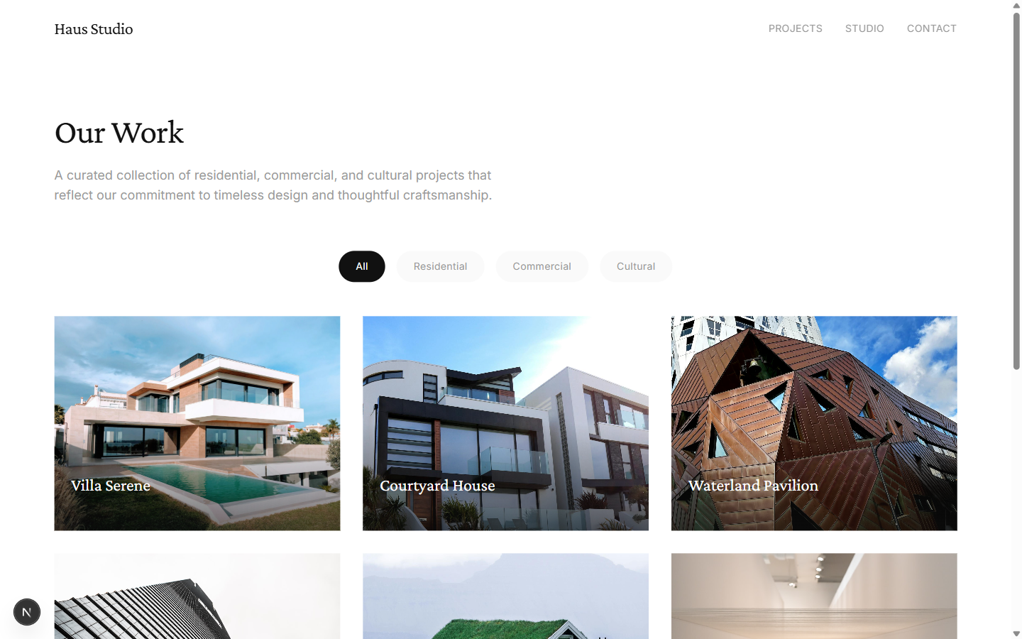
Six Fictional Projects
Residential, commercial, and cultural works across the Netherlands
Villa Serene
A contemporary residence harmonizing traditional Dutch courtyard architecture with modern minimalist design. Handmade brick facades, expansive garden terraces, and ground-source heating.
Courtyard House
An urban sanctuary built around a central courtyard with reflecting pool, blending Dutch canal house proportions with clean geometric forms and floor-to-ceiling glass.
Waterland Pavilion
A cultural exhibition space inspired by the Dutch relationship with water. Undulating zinc roof forms create dramatic light patterns and naturally ventilated twelve-meter halls.
Azure Office
A six-story creative workspace with blue-tinted glass curtain wall, column-free floor plates, cascading atrium stairs, and a rooftop garden. BREEAM Excellent certified.
Stone House
A private residence woven into the island landscape using local fieldstone and dry-stack construction. Walls read as geological formations continuous with the dune terrain.
Lumina Gallery
A contemporary art gallery dedicated to light-based practice. Five exhibition halls with distinct lighting conditions, including a programmable LED skylight in the Central Hall.
Design Language
A monochrome palette that lets architecture speak
Technical Architecture
Precision engineering beneath the restrained surface
Ten Pages, One Vision
Every route designed with the same rigorous restraint